

A Fresh Take on Fintech UI That Actually Feels Good
We opened the NayaPay app this morning and instantly felt the difference.
It wasn’t just a design update — it felt like the app had been reintroduced to us. Polished, confident, and refreshingly modern. What used to be a decent but emotionally distant platform now feels like a product built for people — not just payments.
NayaPay didn’t just redesign their app. They reimagined how a digital financial experience in Pakistan should look, feel, and function.
Why This Rebrand Stands Out
This update speaks to something deeper:
Brand identity isn’t optional anymore — it’s everything.
We’ve always appreciated NayaPay’s core services, but we’ll admit it — their older UI/UX didn’t do justice to the value they were offering. It lacked warmth. The interface felt cold and minimal in a way that was almost… haunting. You opened the app, did your task, and left – without any feeling of connection or delight.
Now? That experience has completely changed.
The new NayaPay feels friendly, intuitive, and thoughtfully built. Every touchpoint has been given personality. The app no longer feels like a tool, it feels like a companion.
What We Loved About the New Experience
As a design-focused team, we couldn’t help but notice the attention to detail in this transformation. A few things really caught our eye:
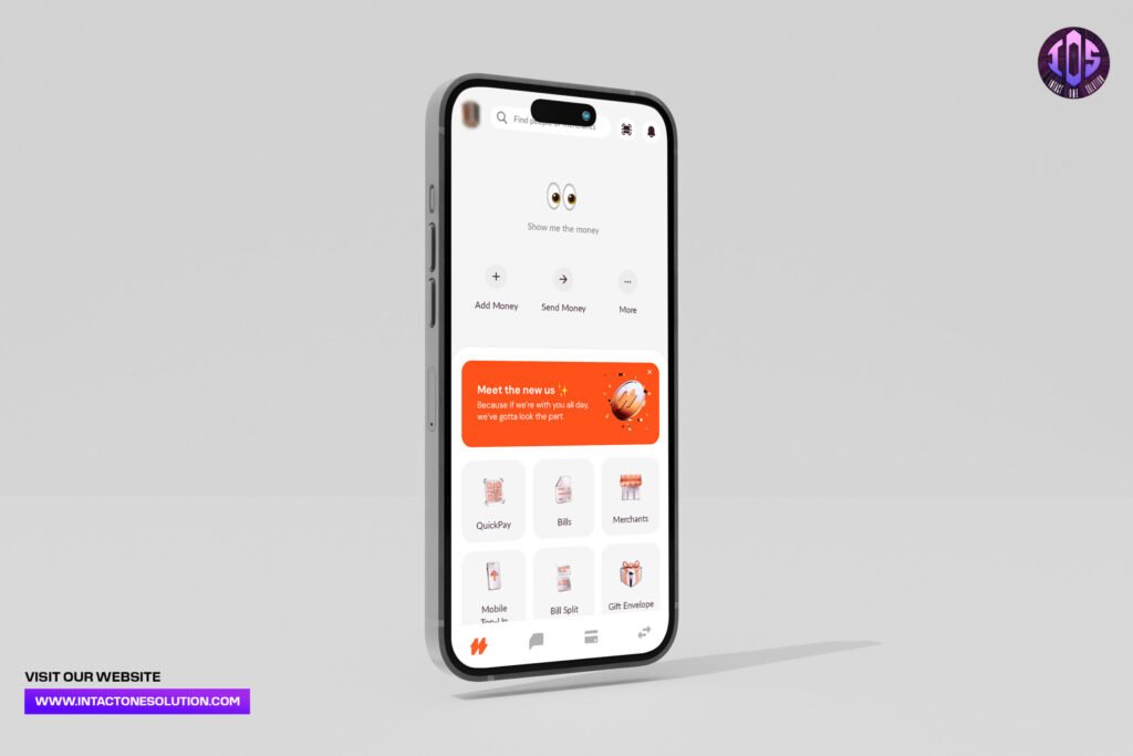
- A clean, minimal interface that doesn’t feel empty
- Smooth animations that make navigation feel effortless
- Well-organized flows for payments, transfers, and QuickPay
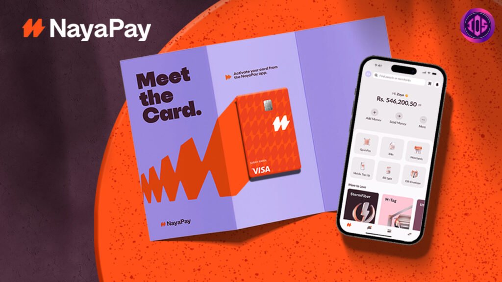
- Visually rich card designs that feel premium, not generic
- Microcopy that actually talks to you — playful, but clear
Even small touches like “Show me the money” add a human layer to the experience. That’s rare, and we’re here for it.
From Functional to Emotional
One of the biggest wins in this redesign is how the app now connects on an emotional level. It’s not just “clean” – it’s confident. Not just “user-friendly” – it feels like it knows its audience.
And that’s the magic of thoughtful design.
When done right, it doesn’t just work. It feels right.
We genuinely think this version of NayaPay better reflects what people want today: a product that’s fast, functional, and still carries a bit of soul.
Only One Tiny Wishlist Item
If there’s one thing we’d love to see in a future update, it’s dark mode.
Purely from a user comfort (and aesthetic) perspective – it would be the cherry on top of an already solid experience.
Final Thoughts.
We’re really impressed by this new direction. At a time when many platforms are slowing down or losing their edge, it’s inspiring to see a local fintech evolving with intention.
This update doesn’t just make NayaPay look better – it makes it feel better. And that’s the part users will remember.
At Intact One Solution, we believe every product should make people feel something – clarity, comfort, excitement. That’s what great design does.
If you’re thinking about refreshing your brand or product experience, now’s the time to move with purpose – just like NayaPay did.
Want your product to feel this intentional?
We help startups, fintechs, and digital platforms craft bold, meaningful experiences that users want to come back to.
Let’s build something unforgettable.